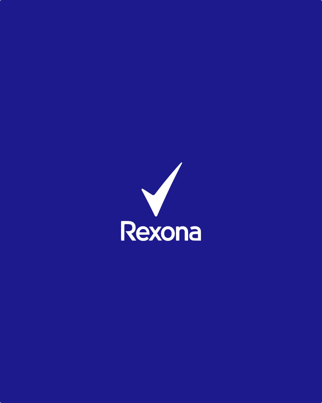

"Move More At Home"
Role: Design | Creative Ideation
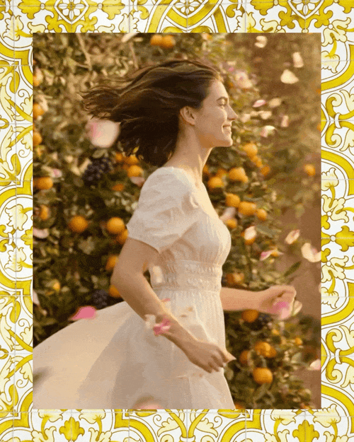
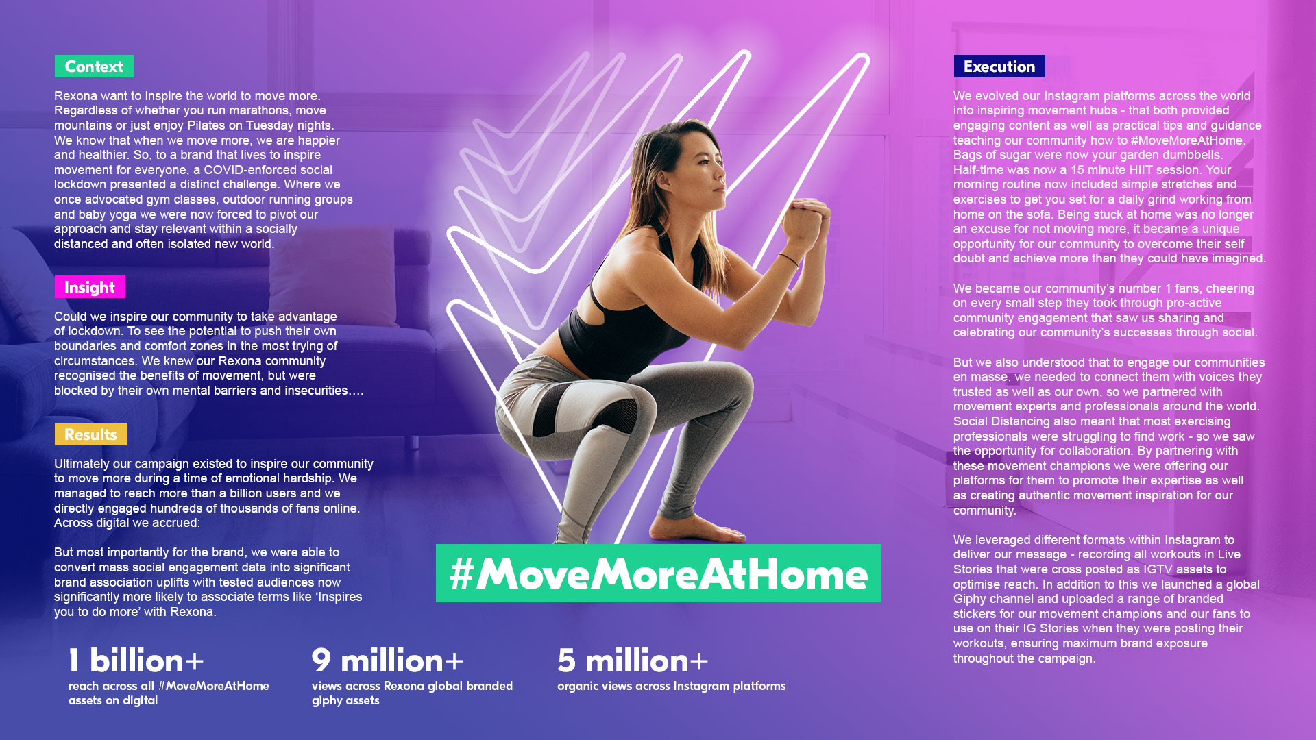
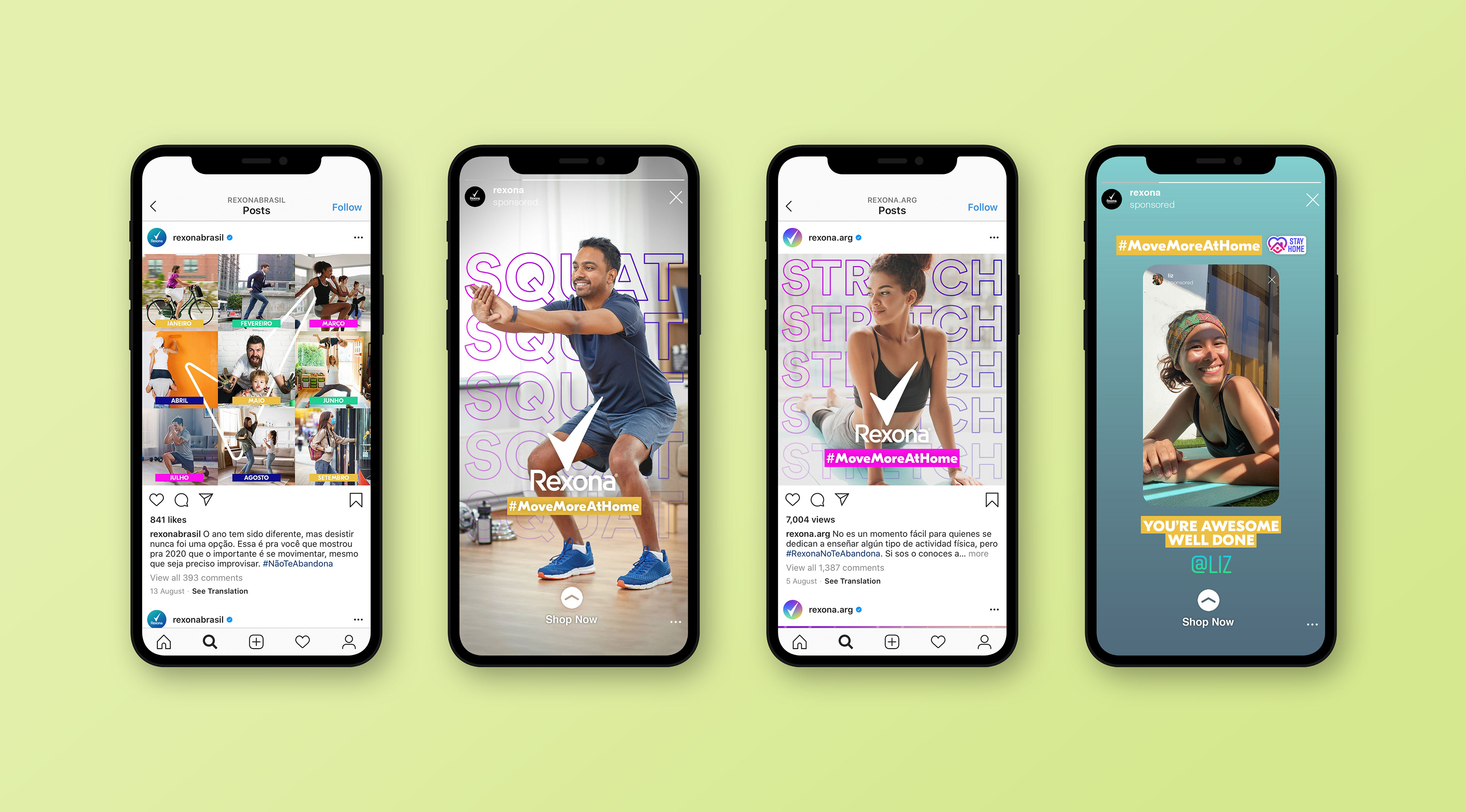
As part of Rexona's global purpose-led initiative Move More At Home, I played a key creative role in developing a bold, accessible campaign that empowered people to stay active and positive during the global lockdown period. This project spanned concept development through to execution, allowing me to shape the visual identity and creative assets at every stage.
The campaign aimed to inspire movement in everyday spaces - transforming homes into arenas of physical and mental wellbeing and my approach needed to reflect this shift with energy, inclusivity, and optimism, while maintaining Rexona’s dynamic and performance-driven brand personality.
This campaign was more than a product push - it was purpose-driven, emotionally resonant, and globally scalable. It ultimately reached over 1 billion people worldwide, proving the power of creative that connects utility with empathy.
As the creative, I ensured consistency and impact across all assets while collaborating cross-functionally with brand, strategy, and localisation teams to maintain speed and global relevance.

"We Work Harder"
Following the success of Rexona’s Move More At Home campaign, we transitioned the brand into a new phase: encouraging people to reclaim outdoor spaces as restrictions eased and movement became more accessible again.
I was involved across every stage of this creative - from early brainstorming and visual concepting to final delivery - crafting a campaign that not only celebrated freedom and physical resilience, but also kept product visibility and sales front and centre.

Creative Strategy
The creative platform "We Work Harder" positions Rexona as a performance partner in the user’s everyday motion. Each asset champions a different expression of movement - skating, running, parkour, and fitness - while tying directly into Rexona's core promise: long-lasting protection that works as hard as you do.
Key Visual Execution
Vibrant, gradient backdrops evoke energy and individuality while reflecting a shift to optimistic, post-lockdown outdoor activity.
The dynamic neon tick reinforces brand recognition and adds a sense of speed and momentum across all movements.
Headline copy like “You Ollie Higher / We Work Harder” is direct and empowering, creating a motivating rhythm across the series.
Product inclusion is prominent yet integrated - heroed in the foreground for instant recognition and shoppability, with variants matched to gender and movement type.
Impact
This creative rollout served as a vital bridge between purpose-led branding and performance marketing - celebrating real people in motion while driving real results. It captured the optimism of a post-lockdown world and repositioned Rexona as a go-to for people getting back out and moving with confidence.